20 live iOS paywalls and what to learn from them
Need some paywall inspiration? Here are 20 of our favorite real-world entries from our recent Apple Vision Pro giveaway to get the creative juices flowing.

Recently, Superwall gave away an Apple Vision Pro (congrats, Owen!). As part of the contest, the community tweeted out tons of paywalls used in their apps today.
I thought it would be interesting to dive into a few of these. So, I picked out a couple of them (in no particular order) that I thought were interesting. Each one has something to take from it and learn from — and a few were even made using Superwall! Let's dive in.
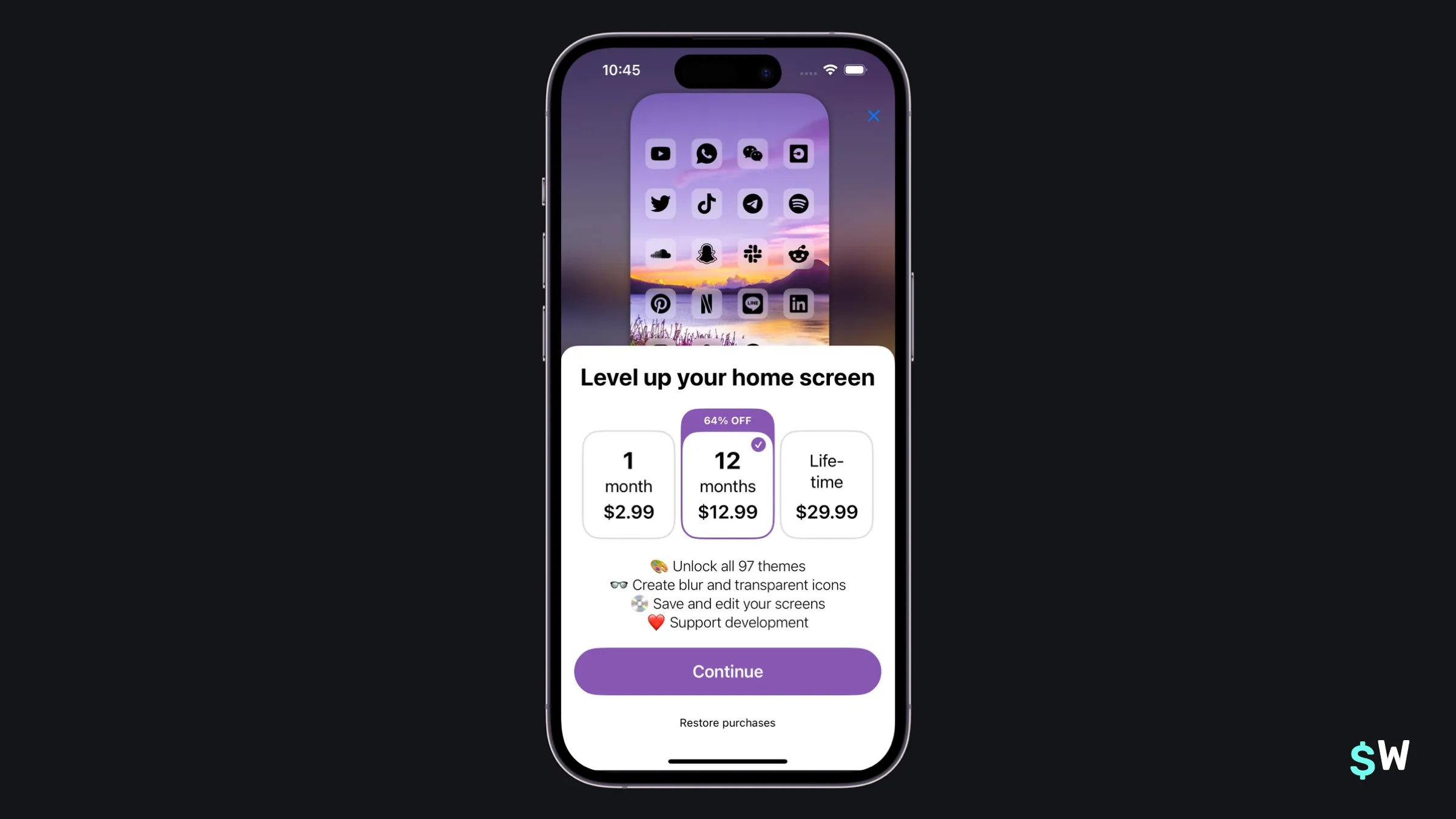
1. Iconboard
Iconboard clearly states all three price points in its paywall. There are several ways to present plans, for example — perhaps a toggle to view them all. But, presenting everything upfront can help with pricing psychology since it's easier to compare, say, a monthly versus a yearly plan. The savings on the latter become more apparent.
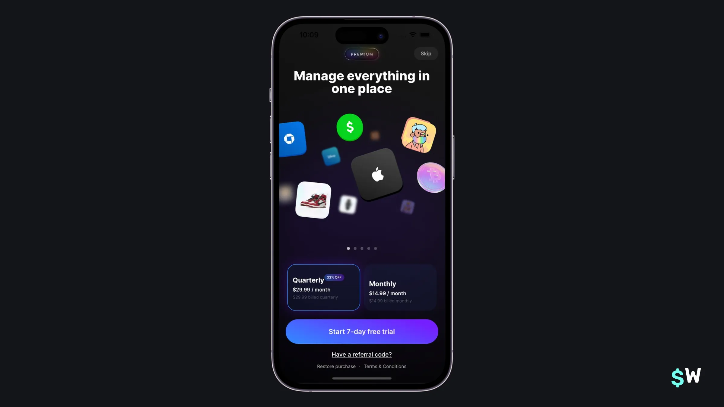
2. ROI
ROI stands out in the design category. It follows the "paging feature" pattern, where a carousel shuffles through all of the plan's benefits. One of the best ways to encourage trials is, of course, to attach them to the biggest call-to-action button. That's exactly what they've done here.
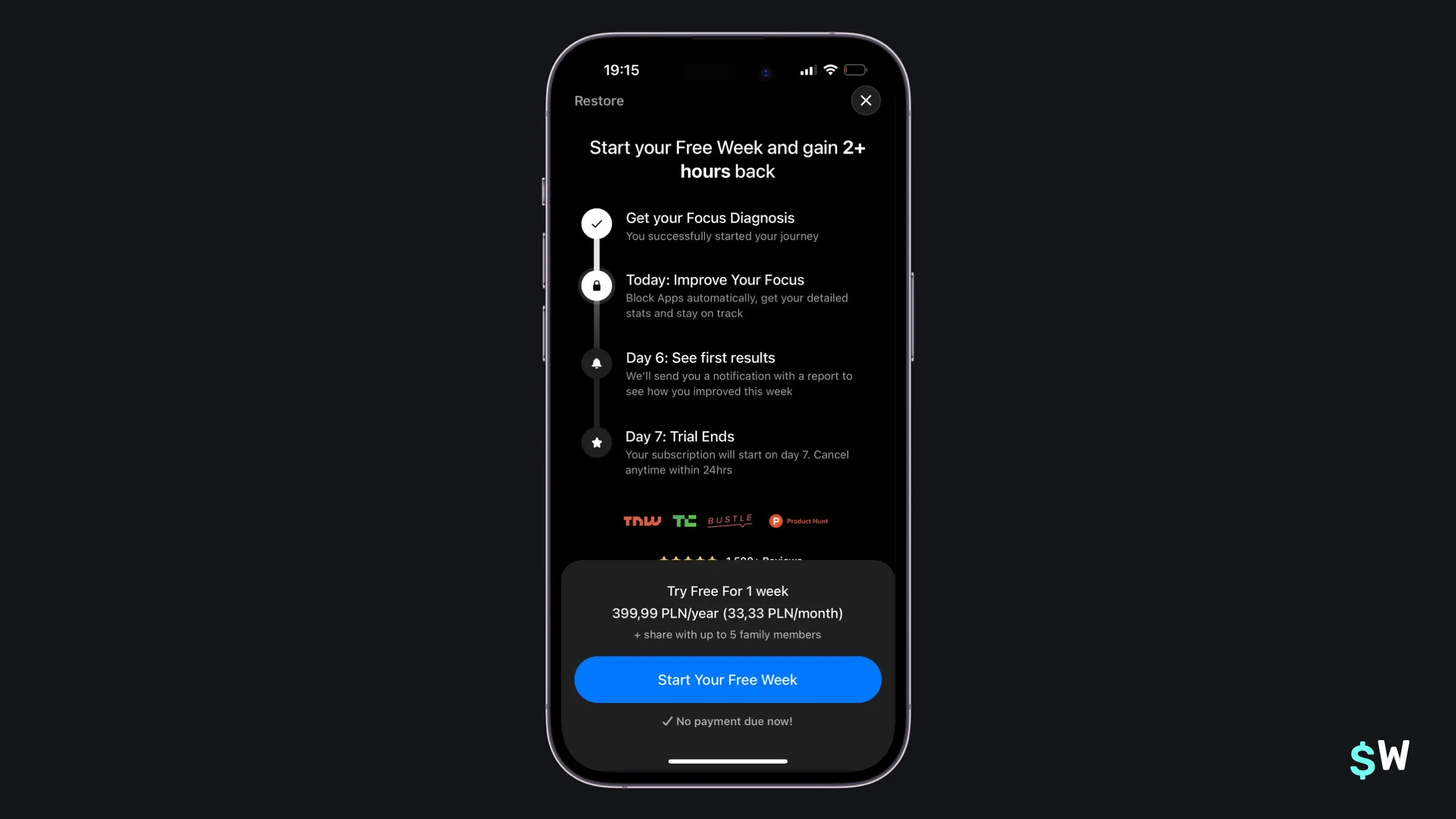
3. Opal
Opal follows a pattern even Apple itself officially endorses now. The "trial" timeline has been popularized in the last few years and for good reason, too. It gives users confidence of how their trial works, and what to expect. It also emphasizes the trial by using the word "free" in their button (i.e. "Start Your Free Week" versus "Start Your Trial").
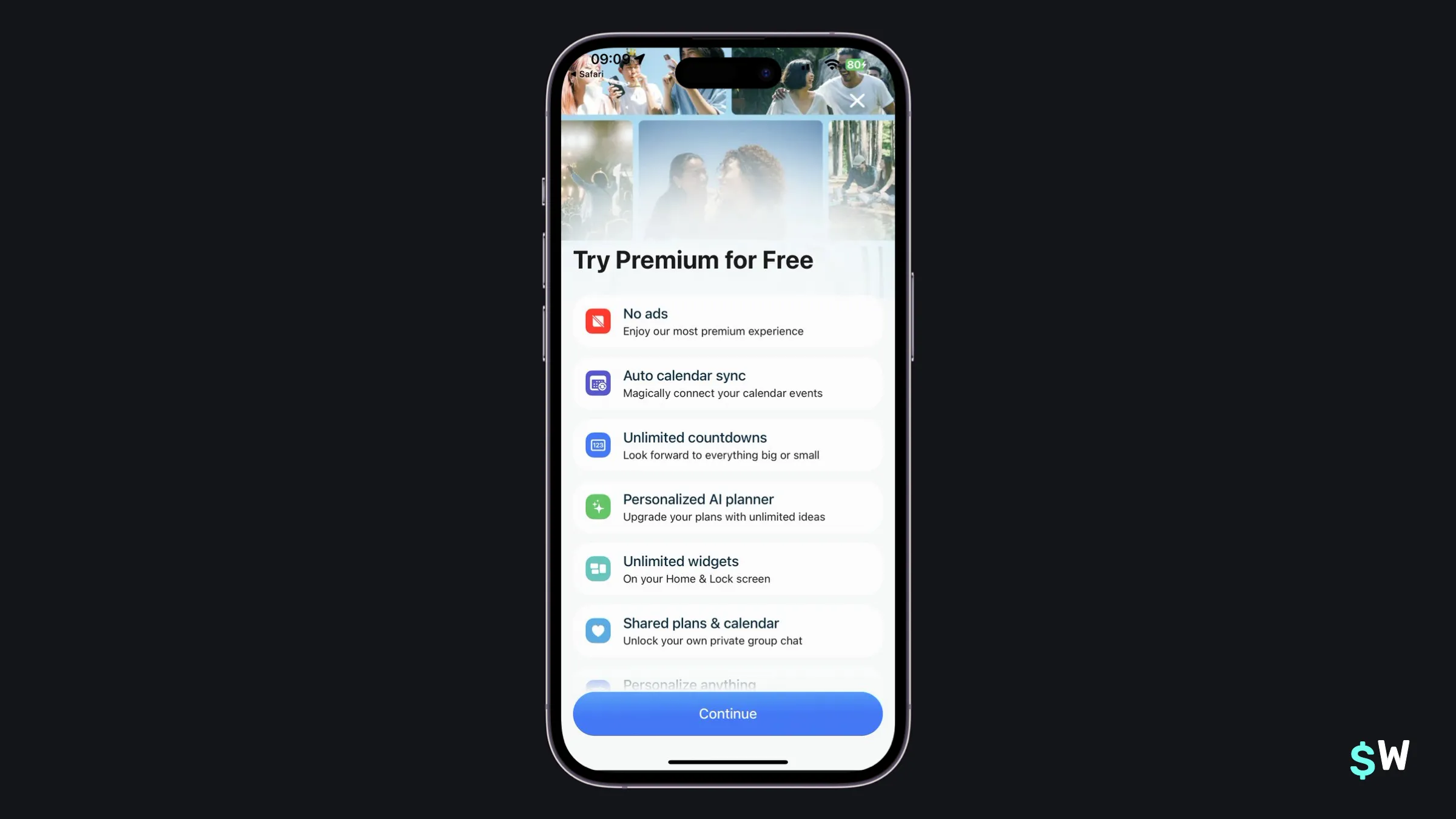
4. Outside
Outside takes a simplistic approach (the feature list) but does it effectively. Easy on the eyes, Outside clearly states what you get in its premium plan. The subtle gradient at the bottom also invites users to keep scrolling to see what other features the premium plan has.
5. Planzera
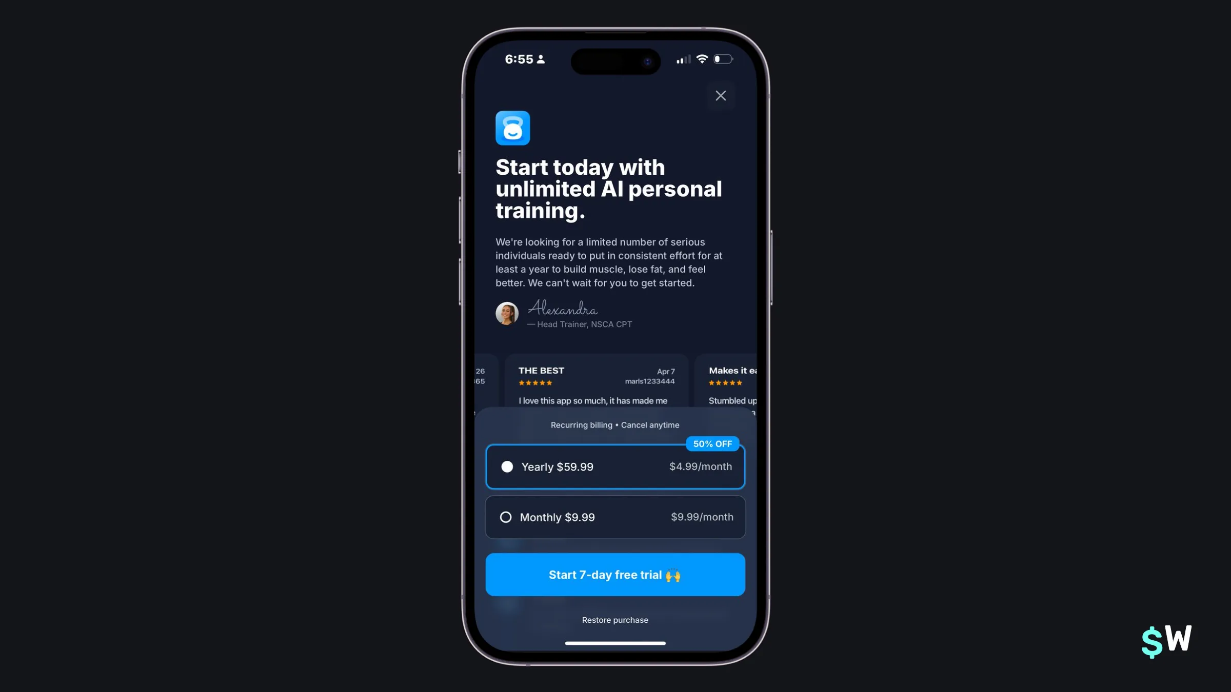
Planzera leverages a powerful technique: social proof. By including happy user's reviews right within the paywall, Planzera reinforces the primary value add of its plan — that it will help you achieve your training goals. Also of note, the "🙌" emoji, which can really work in call-to-action buttons if it fits your app's voice and tone.
6. Food Is Good Co (Fig)
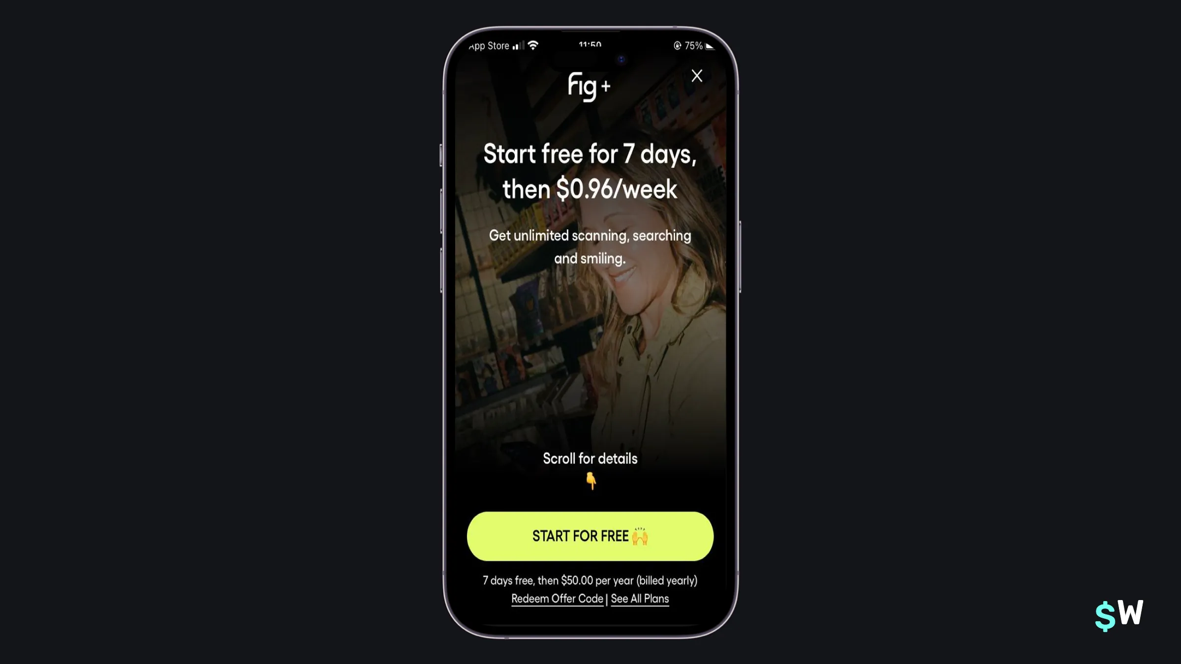
Fig approaches its paywall a bit differently, and I believe it can because of its product positioning. It simply states the trial terms, and the price of one week. Below that is simply one sentence explaining its benefits. Why can they do this? Because most of the folks who come to Fig probably already have an idea of its value add, but either way — scrolling down presents more details.
7. Goalkit
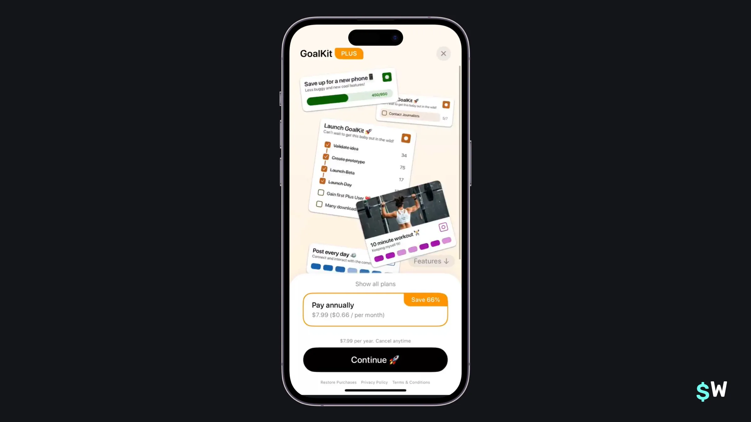
Goalkit takes what I call the "UI chunk" approach. Here, designers pick out core, recognizable parts of the app's user experience, and then show those within a paywall. This helps users clearly understand how they might fit the app into their life, even before they've used it. And again, we see the use of emoji for the call-to-action text.
8. Sunlitt
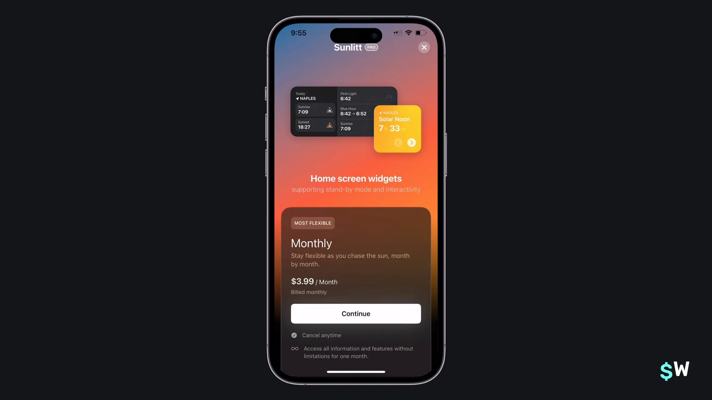
One of Sunlitt's primary value propositions is the use of widgets. Similar to Goalkit above, they reinforce that notion by including a widget right into the paywall. If your app has a unique angle to push, taking a similar approach can be an effective way to increase conversions (or trial starts).
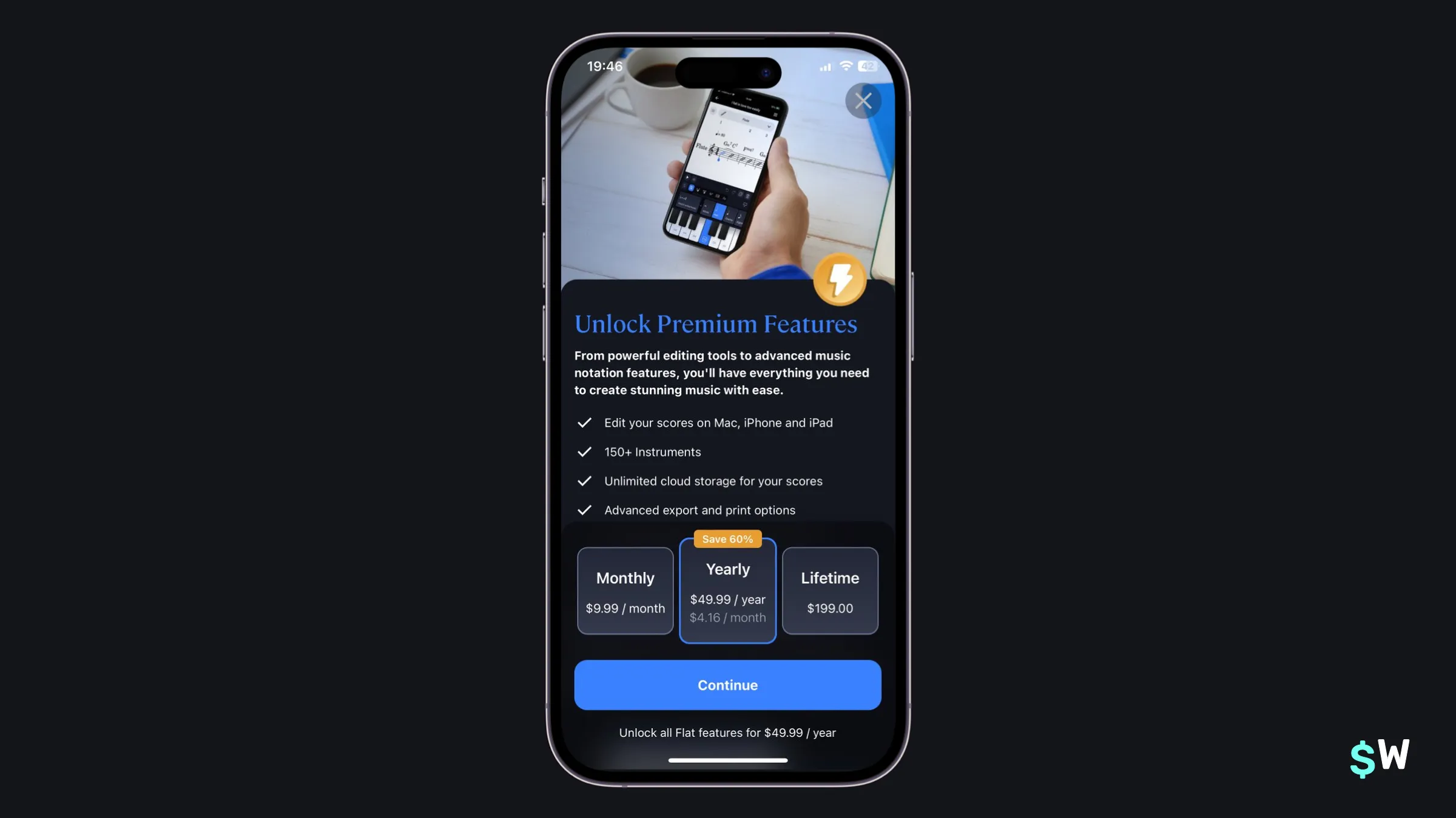
9. Flat
Flat does two things here: presents all of its pricing information and the core benefits of its premium offering. A lot of times, it's one or the other with a fair amount of scrolling required. Here, users see all plans and benefits without any extra work from them — plus, Flat also includes the monthly price under its yearly offering.
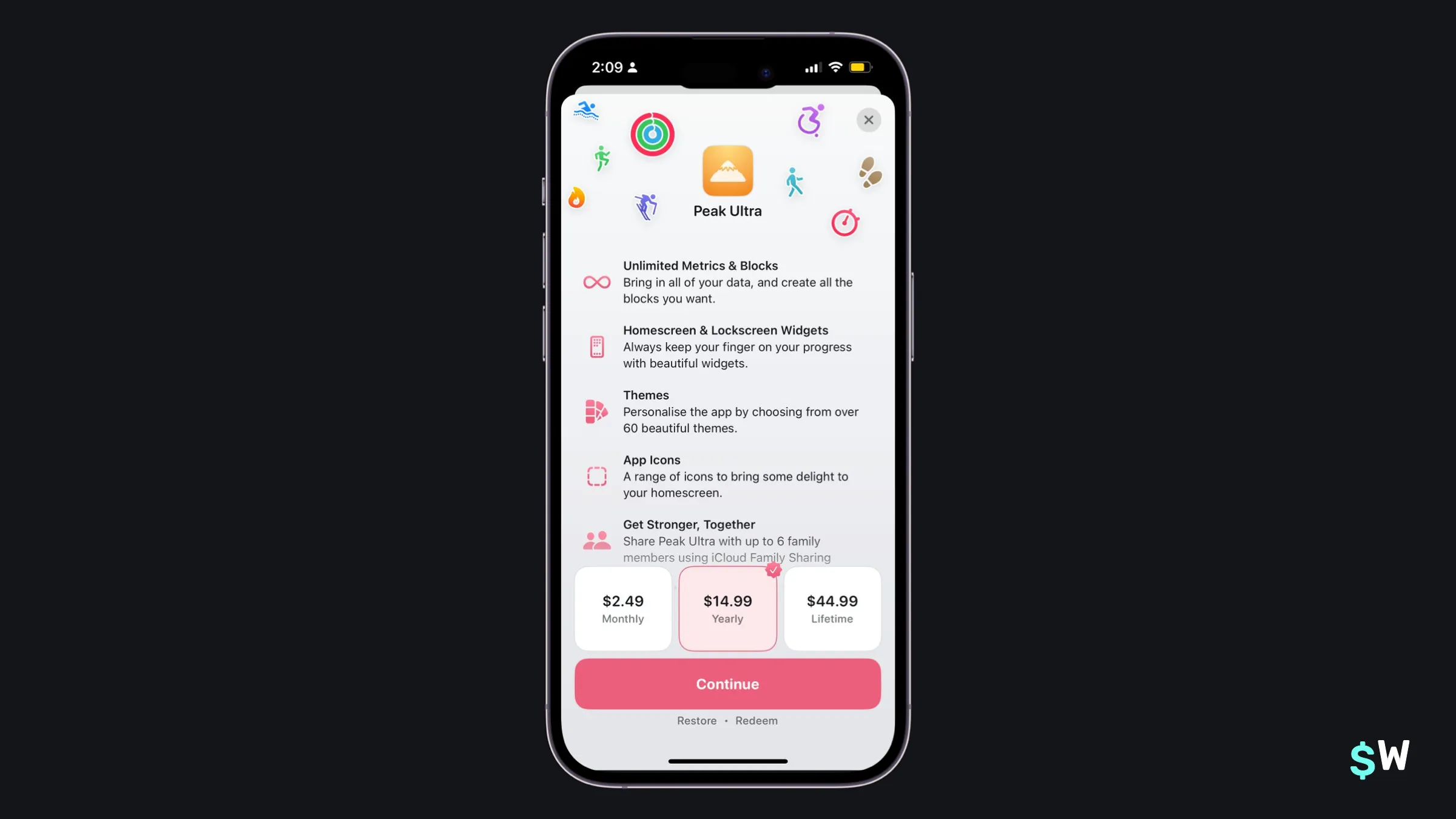
10. Peak
Peak combines the "feature list" with all pricing options. As we saw earlier, the light gradient above the purchase buttons invite users to check out more benefits. Overall, Peak leverages its app voice effectively by incorporating iconography that's prominently used in other parts of the app's user interface. A fun little addition is the verified-esque badge showing on the top-trailing side of the selected plan.
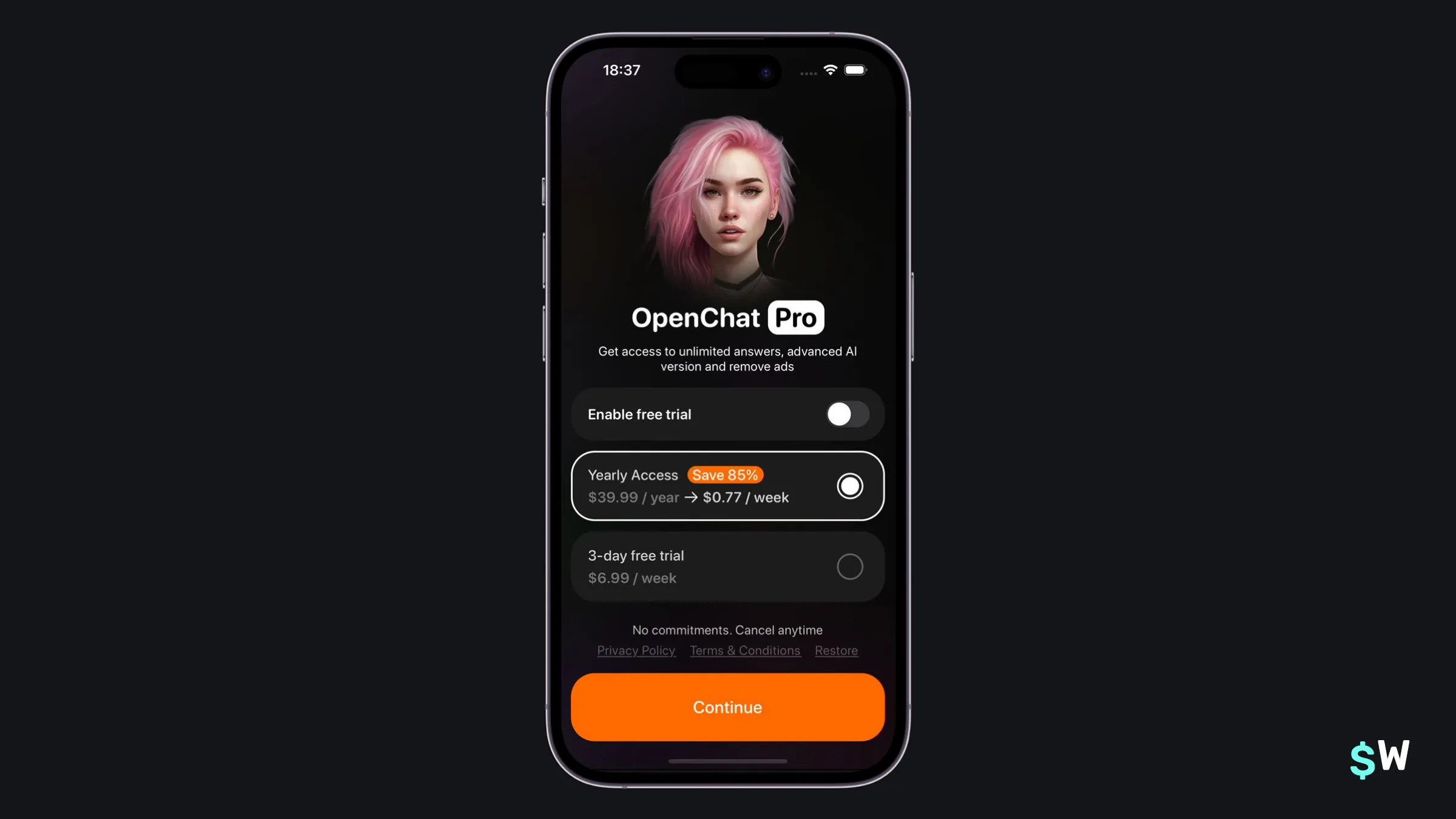
11. OpenChat
OpenChat uses the free trial toggle approach. This user experience can help point people to a particular plan. Here, the toggle automatically selects the weekly plan below. Even though its selectable on its own, the toggle reinforces the notion that the trial is included when this plan is chosen.
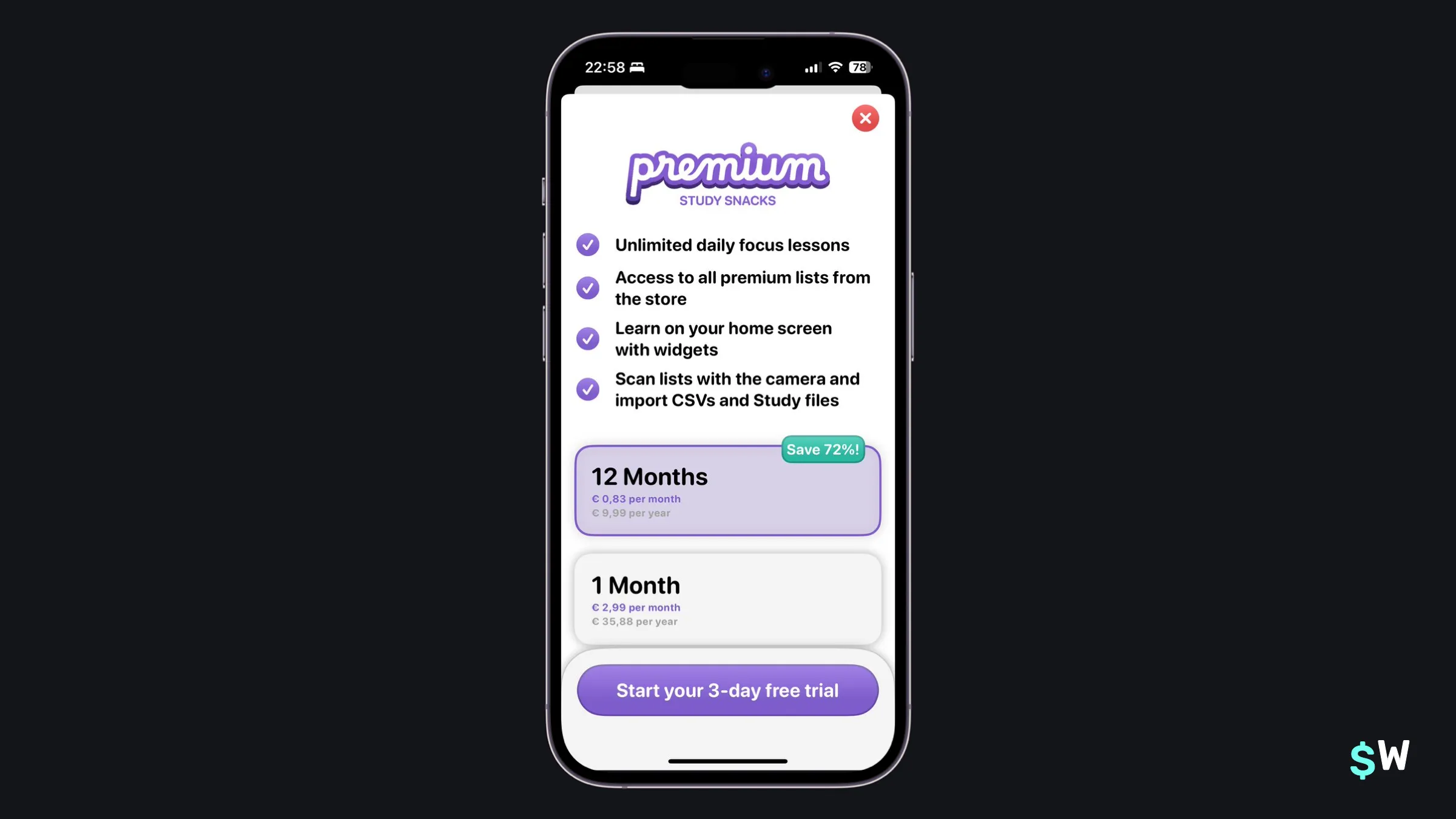
12. Study Snacks
Study Snacks encourages users to check out its annual plan by showing how much more they'll save in comparison to its monthly plan. Similar to how some apps will show an annual plan, but what it equates to monthly below the text, placing a "Save X%" amount serves the same purpose. The savings are more obvious to some users when presented in a percentage-based fashion, as Study Snacks has done here.
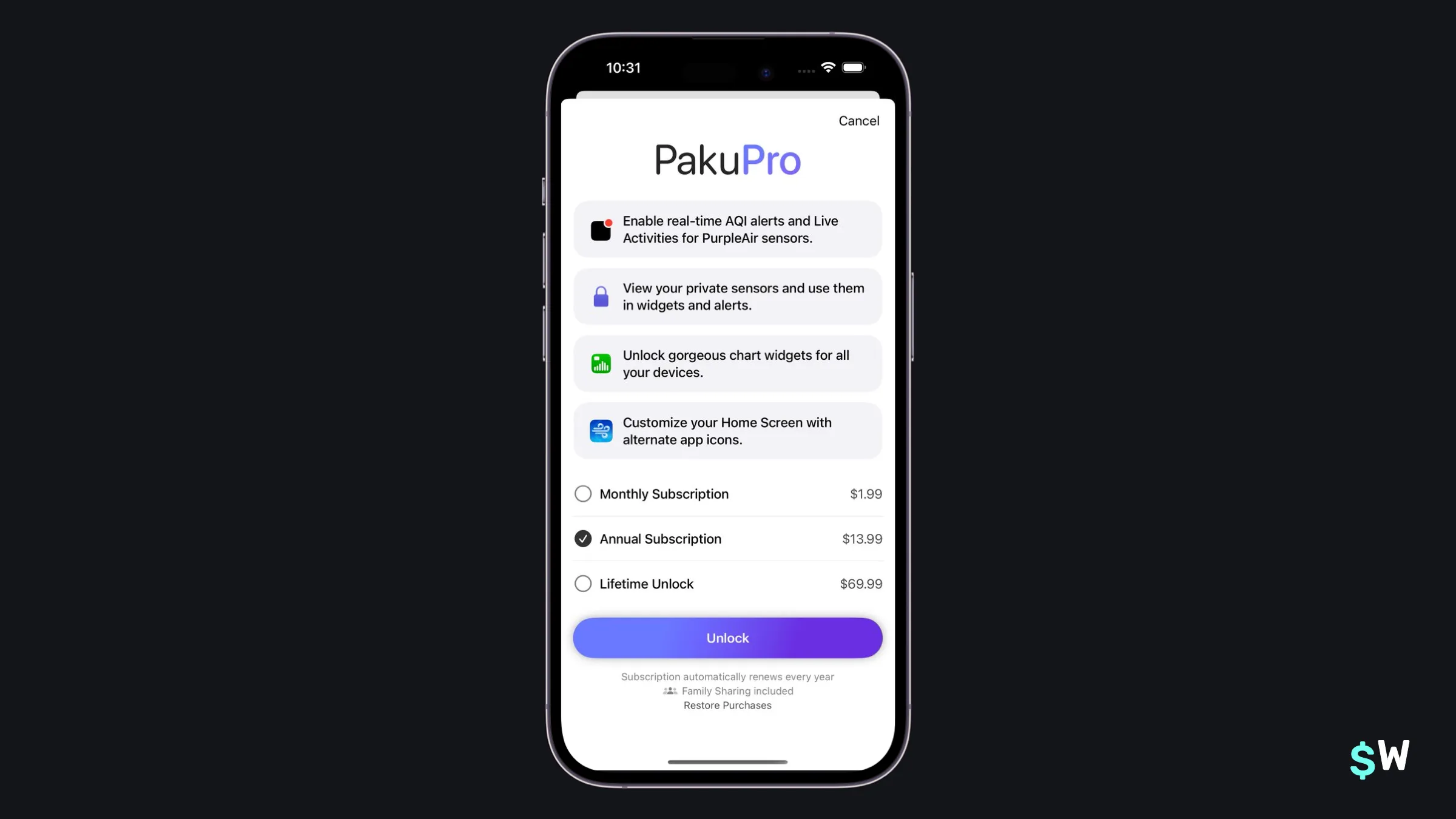
13. Paku
Paku shows off four main benefits of its Paku Pro plan, and makes its price points easily digestible. It's a "less is more" approach that works well because the app itself has a razor sharp focus too. Paku's design is a perfect reminder that sometimes we shouldn't overthink paywalls, as it takes a minimal approach but does it correctly.
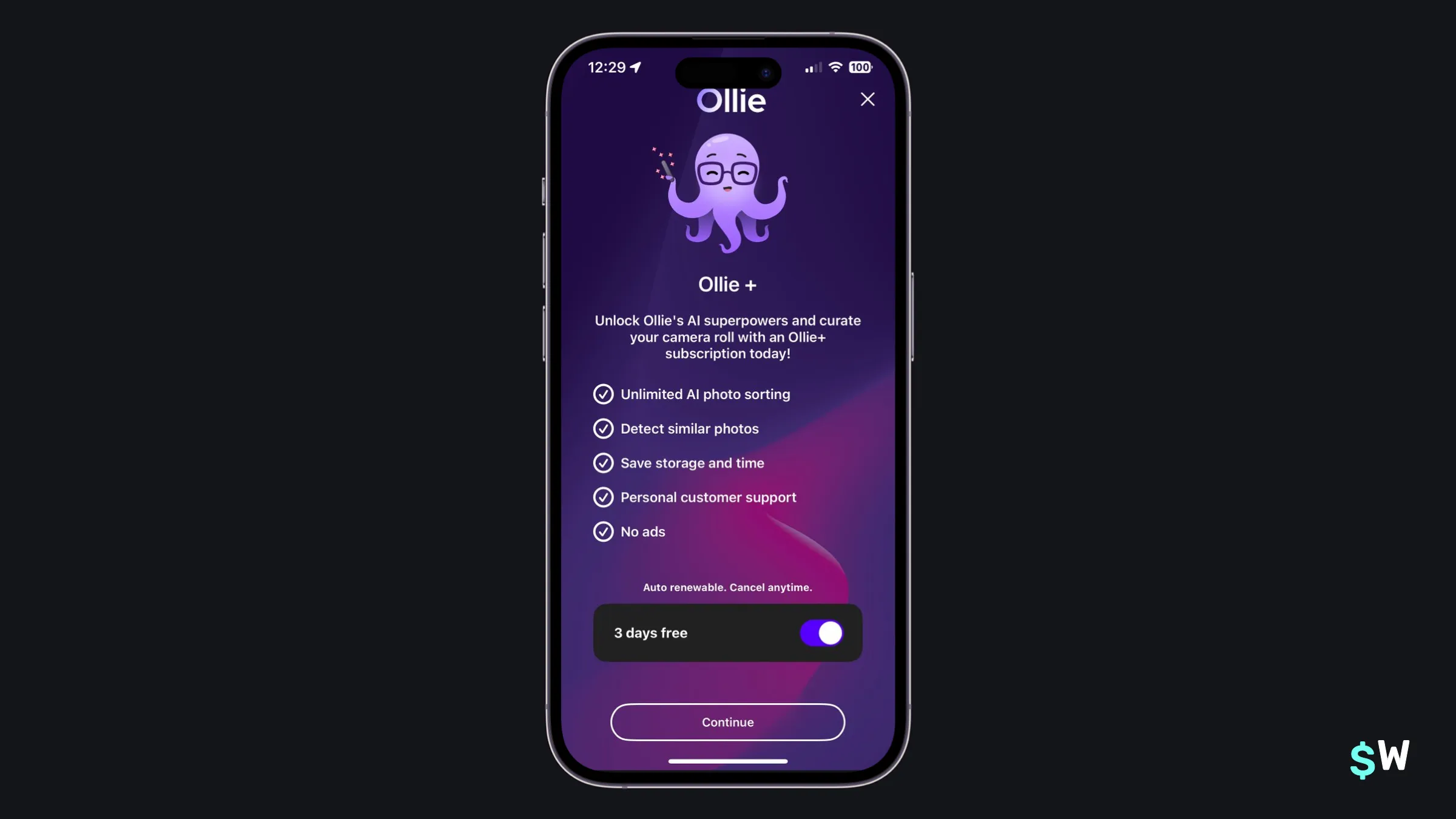
14. Ollie
Ollie pushes its branding effectively. Its developer, Keepbox Inc, leverages its octopus mascot in its App Store screenshots as well (and, I'd assume, in any advertising they may do). Of note, Ollie includes the trial toggle with a "Continue" call-to-action button with text that changes depending on the toggle. When it's off, it reads "Not sure yet? Enable free trial" to encourage that route.
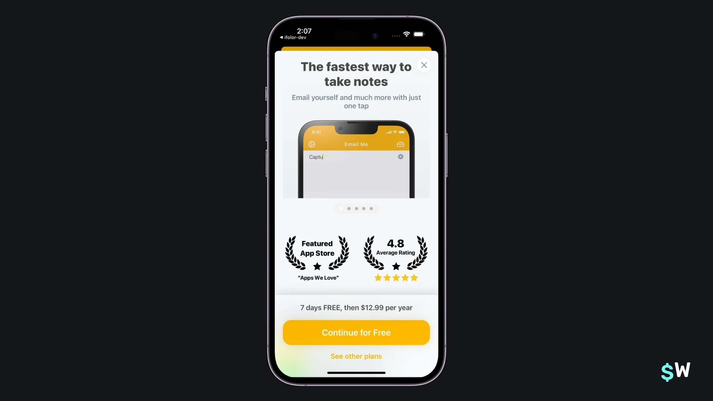
15. Email Me
Email Me also uses a form of social proof beyond including App Store reviews — it shows off Apple's seal of approval by mentioning it's been featured. That, along with a high average rating, is a great way to instill user confidence. Along with a feature carousel, it lists out trial and pricing details in clear terms above the button, which allows the button's text to say something else. In this case, "Continue for free" is a strong call-to-action.
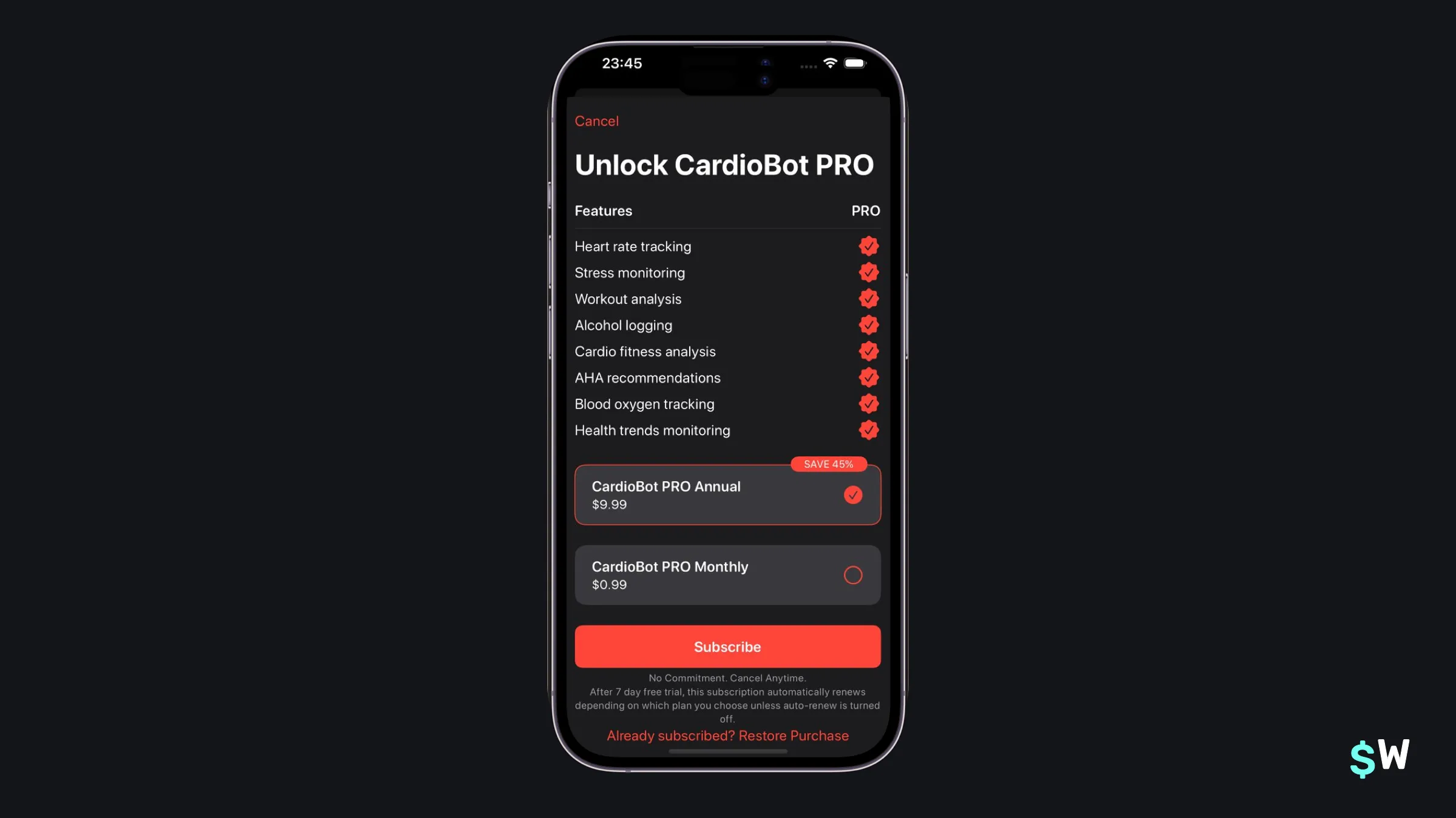
16. Cardiobot
Cardiobot is a great example of how paywalls can use a culmination of effective ideas together. We've seen paywalls with the feature list, pricing discounts on yearly plans and viewing all plans together in a lot of these examples. Here, Cardiobot shows how its possible to do all of those things together.
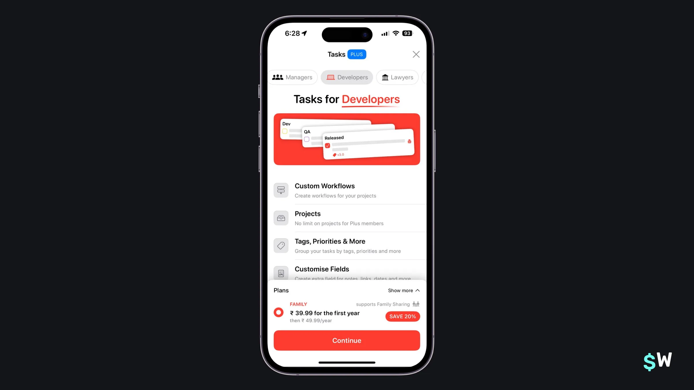
17. Tasks
Tasks takes a pointed approach: the use case scenario. Since Tasks can be used for several different purposes, it tailors its paywall to show how each of those common use cases can be solved by using the app. The toggle at the top changes out the text and color scheme (a nice touch) for each scenario and, overall, it's a good lesson in how paywalls can work well when an app has a large surface area of uses.
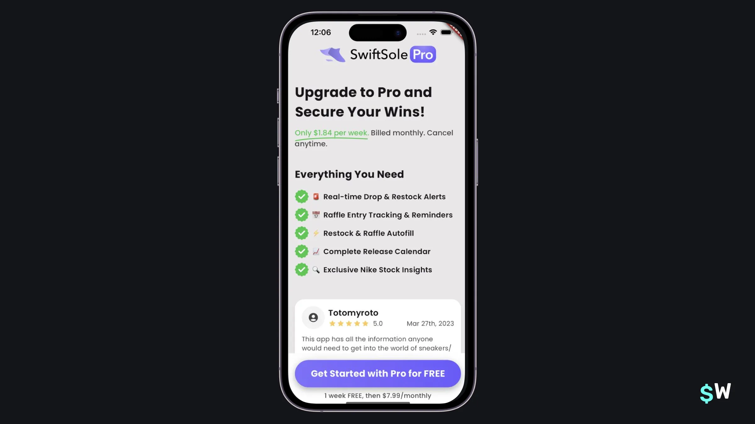
18. Swift Sole
It sounds simple, but it's true — simply emphasizing the word "free" can work wonders. SwiftSole takes that to heart in its call-to-action, which has "free" capitalized. Some more touches include showing the selected plan's price in weekly terms at the top, as well as a nice section of social proofs by way of user reviews.
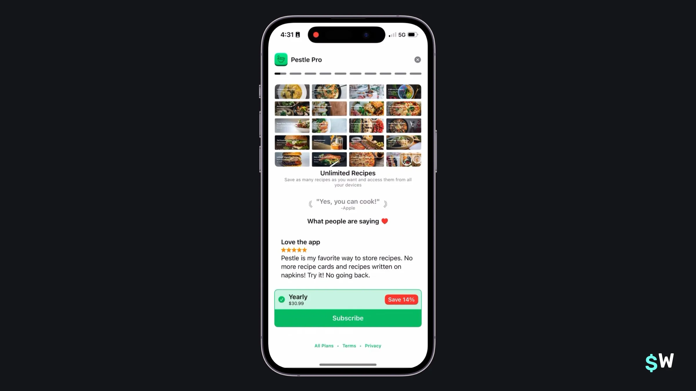
19. Pestle
Pestle takes a "stories" approach. At the top, you'll see the easily understood "story lines", which work as they do on most social media apps. Each feature is a story entry, and they are automatically toggled through. This can be an engaging and novel way to show off your subscription's best features.
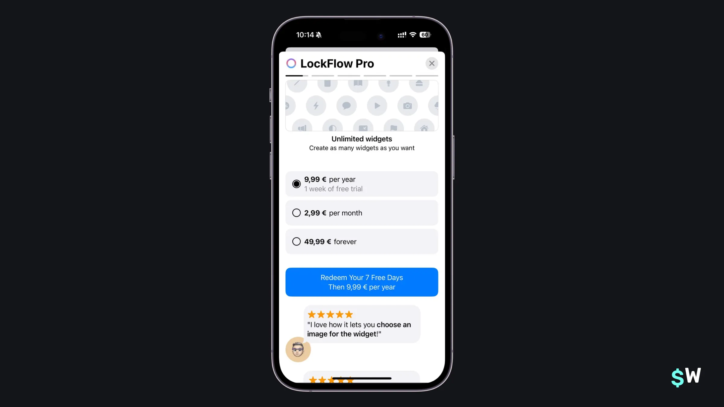
20. LockFlow
And finally, we have LockFlow. I included LockFlow mainly because of its copy — specifically, the word "Redeem". Copy matters, and using a word like "redeem" can be a stronger call-to-action. Here, you aren't just starting a free trial, you're claiming it. Also notable are the social proofs found under the pricing options (typically, I've seen it reversed).
Final thoughts
If there's anything to take from this post, it's that there's no one-size-fits-all answer to paywalls. Each app, its target audience, products and pricing are always different. Even though many apps have overlap, each one takes their own unique approach. It takes a lot of work to figure out what works.
And, that's really it — trying different things is what helps you get to that sweet spot where conversion rates are high, and acquiring users gets a little easier. If you need more paywall inspiration, Superwall has an entire gallery here. Or, if you're new to Superwall — then get started with a free account and follow the docs to get up and running.