The Paywall Growth Lever Framework: How to Build Smarter Experiments, Faster
How we structure paywall experiments at Superwall: isolate variables, build clear hypotheses, and test across five core levers to move from random testing to systematic growth.
When most teams start testing paywalls, they jump straight into building new designs — swapping out a headline here, a color there, maybe adding a free trial toggle or a new button. But without a clear hypothesis, those tests tend to blur multiple variables at once.
That's how you end up with muddy results: you know something changed, but not what or why it worked.
At Superwall, we've learned that the best growth teams don't run random paywall tests — they run structured experiments. They know exactly which part of the user experience they're manipulating and which KPI they're trying to move.
That's where the Paywall Growth Lever Framework comes in.
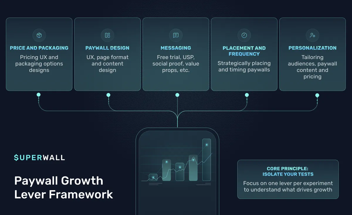
This is the model I use when helping teams plan experiments: break every paywall hypothesis down into one of five levers — Pricing & Packaging, Paywall Design, Messaging, Placement & Frequency, and Personalization.
Each lever targets a specific part of the conversion journey, and each one requires a different kind of thinking.
In this post, I'll walk you through all five — what they mean, examples of the most common tests we see, and the three experiments I'd recommend every app run in each category to start building momentum.
1. Pricing & Packaging
This is where most teams start, and for good reason — pricing and packaging directly affect perceived value and purchase intent. But "pricing test" doesn't just mean "try $9.99 instead of $7.99." It's about how you structure the offer: length of trial, billing cadence, intro discounts, and even how many choices you give a user.
I've seen apps double revenue by simply reframing the choice architecture — from "monthly vs annual" to "start with a 3-day free trial or 30 days for $4.99." That's still one product, just packaged differently.
3 Experiments to Start With
1. The Trial Length Test
- Hypothesis: A shorter free trial (3 days vs 7 days) will increase urgency and reduce churn before conversion.
- Variant Change: Compare 3-day vs 7-day trials on the same plan.
- KPIs: Trial start rate, trial-to-paid conversion rate, net proceeds per user (RPU).
- Why it works: It forces commitment faster. Shorter trials tend to drive higher conversion from trial-to-paid, especially for monthly plans.
2. The "Design Your Trial" Paywall
- Hypothesis: Giving users a choice between a short free trial and a longer paid trial will improve conversion and LTV.
- Variant Change: Offer two annual plans — one with a 3-day free trial and another with a 30-day paid trial (e.g., $4.99).
- KPIs: Conversion rate, trial-to-paid rate, retention after 30 days.
- Why it works: Users feel in control — they're not choosing whether to buy, they're choosing how to start. This framing consistently outperforms standard trial vs. no-trial paywalls.
3. The Anchor Test
- Hypothesis: Highlighting the annual plan as the default will lift overall revenue even if monthly conversion dips.
- Variant Change: Shift design emphasis to annual (e.g., larger button, "Best Value" tag).
- KPIs: Plan mix (annual vs monthly), average revenue per user, retention at 90 days.
- Why it works: Anchoring reframes what "normal" looks like — users use the default as a reference point.
2. Paywall Design
The design lever is about how your paywall feels, not just what it says. The layout, visual hierarchy, and number of steps all shape user perception of trust and value.
A paywall is a form of storytelling: what's the emotional flow between the moment a user hits "continue" and the moment they commit? In the Bootcamp sessions, we often saw teams make the mistake of mixing too many elements — testimonials, feature lists, animations, and pricing all fighting for attention.
The best designs are focused: they have one clear visual focus and a frictionless way to say "yes."
3 Experiments to Start With
1. Single vs. Multi-Step Paywall
- Hypothesis: A two-step paywall (value → offer) will increase perceived value and lift conversion.
- Variant Change: Add an intro page highlighting benefits before showing the pricing options.
- KPIs: Conversion rate, average session duration, scroll depth on step 1.
- Why it works: The first screen builds intent; the second closes the deal.
2. Social Proof Layout Test
- Hypothesis: Adding visible social validation (reviews, ratings, testimonials) will increase purchase confidence.
- Variant Change: Add a "Rated 4.9 stars by 20,000 users" section above the CTA.
- KPIs: Conversion rate, paywall engagement rate, scroll completion.
- Why it works: Users often need a final push — seeing that others found value validates the decision.
3. Trial Timeline Design
- Hypothesis: Visually framing the trial as a timeline (what happens each day) increases perceived momentum.
- Variant Change: Replace static pricing layout with a "7-day journey" graphic that maps progress through the trial.
- KPIs: Trial start rate, trial completion, trial-to-paid conversion.
- Why it works: It turns the paywall into a roadmap, not a transaction — users feel like they're enrolling in a journey.
3. Messaging
The words on your paywall can change everything.
I've seen teams spend weeks on new designs when what they really needed was a copy rewrite. Messaging is about articulating value and emotion. The best copy connects the problem users just experienced in onboarding to the solution your product provides.
At Superwall, we often encourage teams to think in terms of contextual promise — what is the user trying to accomplish right now, and how does your offer help them do it?
3 Experiments to Start With
1. Problem-to-Promise Copy Test
- Hypothesis: Copy that mirrors the user's recent action ("You just tracked your first habit — now make it stick") will increase relevance and conversion.
- Variant Change: Replace generic headline with contextual, action-based copy.
- KPIs: Conversion rate, bounce rate from paywall.
- Why it works: Users see themselves in the copy — it feels like a continuation of their journey, not an interruption.
2. Value-Led vs. Feature-Led Copy
- Hypothesis: Framing around outcomes ("Get consistent") outperforms features ("Unlimited reminders").
- Variant Change: Rewrite headline and subtext around emotional benefits rather than product specs.
- KPIs: Conversion rate, trial start rate, retention after day 7.
- Why it works: Emotion drives action. Features justify it later.
3. Emotional Framing Test
- Hypothesis: Copy that uses emotional motivators (fear of loss, aspiration, or belonging) will outperform neutral, informational messaging.
- Variant Change: Create variants using different emotional tones — e.g., "Don't lose your streak" (loss aversion) vs. "Keep your progress going" (aspiration).
- KPIs: Conversion rate, engagement with CTA, retention.
- Why it works: Subtle shifts in tone can reframe urgency and motivation, especially when aligned with a user's intent.
4. Placement & Frequency
Even the best paywall design won't perform if users never see it. Placement experiments test when and where the paywall appears in the user journey — onboarding, after key feature use, post-success event, or reactivation moments.
In Bootcamp sessions, we often saw that apps with long onboarding flows underexposed users to their paywall. In one case, only 40% of new users ever saw it. Simply increasing visibility to 80% lifted total revenue linearly, even before improving conversion.
3 Experiments to Start With
1. Onboarding Placement Test
- Hypothesis: Showing a paywall after the first "aha" moment (not before) will increase conversion without hurting retention.
- Variant Change: Move paywall trigger from "first open" to "completed first task."
- KPIs: Conversion rate, onboarding completion, session retention.
- Why it works: The earlier users understand value, the more willing they are to pay — but too early and it feels premature.
2. Soft → Hard Paywall Sequence
- Hypothesis: Introducing a non-gated ("soft") paywall before a hard gate will warm users up and increase eventual conversion.
- Variant Change: Show a soft paywall after a share or engagement event, then hard gate later in flow.
- KPIs: Combined conversion rate, engagement between paywalls, cancel rate.
- Why it works: The first exposure builds familiarity. When the hard paywall appears later, it feels like a natural next step.
3. Re-Engagement Paywall
- Hypothesis: Showing a personalized paywall on re-entry after 3 days will recover churned trials.
- Variant Change: Trigger a targeted paywall when a user opens the app after 72 hours of inactivity.
- KPIs: Re-activation conversion, net new trials started, retention.
- Why it works: It reframes the offer as a reminder, not a sale — especially powerful for users who paused just before trial start.
5. Personalization
Personalization is the newest and fastest-growing lever. It's about dynamically tailoring paywalls based on user attributes — country, engagement level, acquisition source, or even the content they interacted with.
You don't need machine learning to do this. Even basic rules like "show different copy depending on what users told you during onboarding" can have a huge impact.
In one Bootcamp session, we saw a team build dynamic paywalls that referenced users' onboarding answers — their goals, time commitment, or motivation. Just adding that contextual thread lifted conversion by 10–15%.
3 Experiments to Start With
1. Onboarding-Response Personalization
- Hypothesis: Referencing a user's stated goals or motivations from onboarding increases relevance and purchase intent.
- Variant Change: Dynamically change the headline or subtext based on answers like "I want to reduce stress" or "I want to build muscle."
- KPIs: Conversion rate by segment, engagement with CTA, post-purchase retention.
- Why it works: When users feel seen — that the app understands why they're here — they're far more likely to buy.
2. Geo-Based Pricing & Copy
- Hypothesis: Localizing currency and tone for top markets increases conversion.
- Variant Change: Add region-specific price displays and localized messaging for top 3 countries.
- KPIs: Conversion rate by country, RPU by country.
- Why it works: Cultural and price perception differences matter — especially between USD and Euro markets.
3. Source-Based Personalization
- Hypothesis: Users from performance ads respond differently than organic users, so adjusting tone by acquisition source improves conversion.
- Variant Change: Show a paywall that matches ad context for users coming from Meta or ASA.
- KPIs: Conversion rate by source, blended RPU.
- Why it works: Consistency between ad promise and paywall experience prevents cognitive dissonance.
Why This Framework Matters
When you start thinking in levers, you stop testing blindly. Each lever helps you isolate variables and interpret results clearly.
You'll know whether your last win came from better pricing logic, more emotional copy, or just smarter placement timing — and that clarity compounds.
That's how teams like the ones we work with at Superwall start running dozens of experiments a month without losing rigor. They don't waste weeks debating ideas; they map them to a lever, define a hypothesis, and launch.
And when results come back, the framework makes post-test analysis cleaner. You can look at your test history and see which levers your app has already saturated — maybe design tests are plateauing, but messaging or personalization still have room to run.
Final Thoughts
If you're just starting out with paywall testing, don't overcomplicate it. Pick one lever — any of them — and ship your first clean experiment this week.
The most successful teams aren't the ones who run the fanciest experiments. They're the ones who keep testing, learning, and stacking small insights until they have a playbook that's uniquely theirs.
The Paywall Growth Lever Framework just gives you a language for that process — a way to stay systematic while still staying creative.
Want to put this framework into practice? Superwall makes it easy to test paywalls without shipping app updates — so you can run experiments across all five levers and actually know what's working. Get started with a free account →